
Petrovka
Making of: PART I

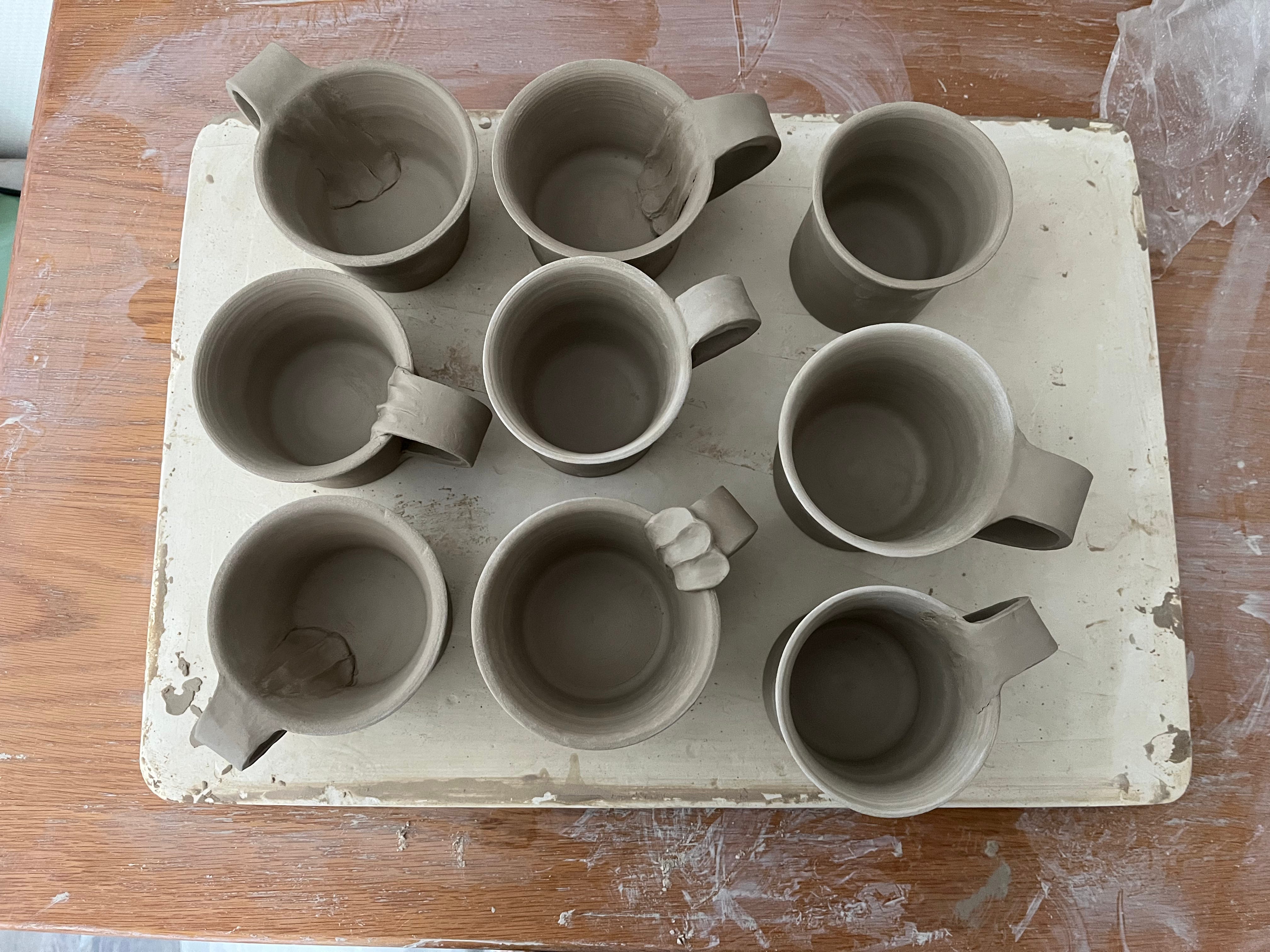
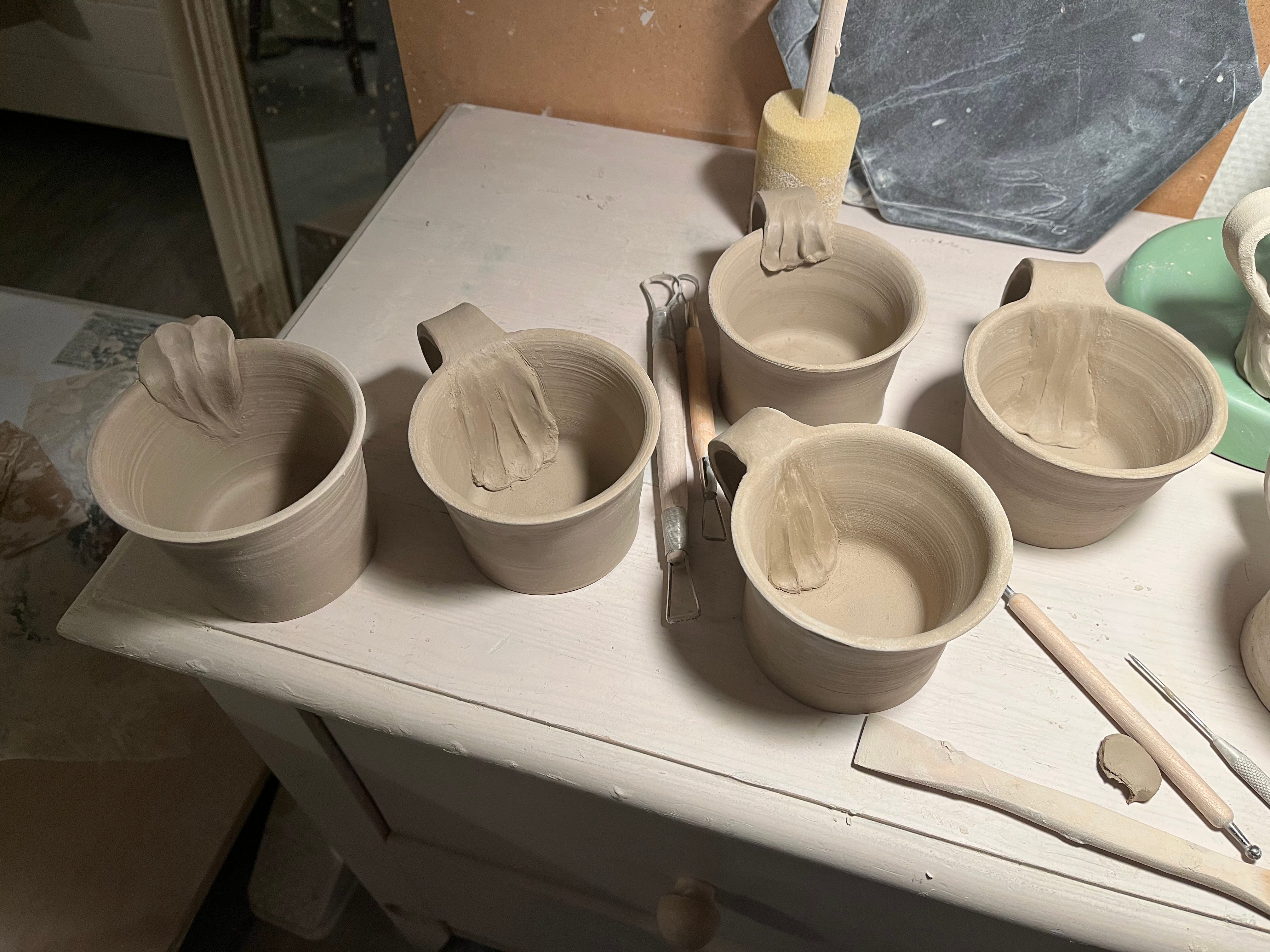
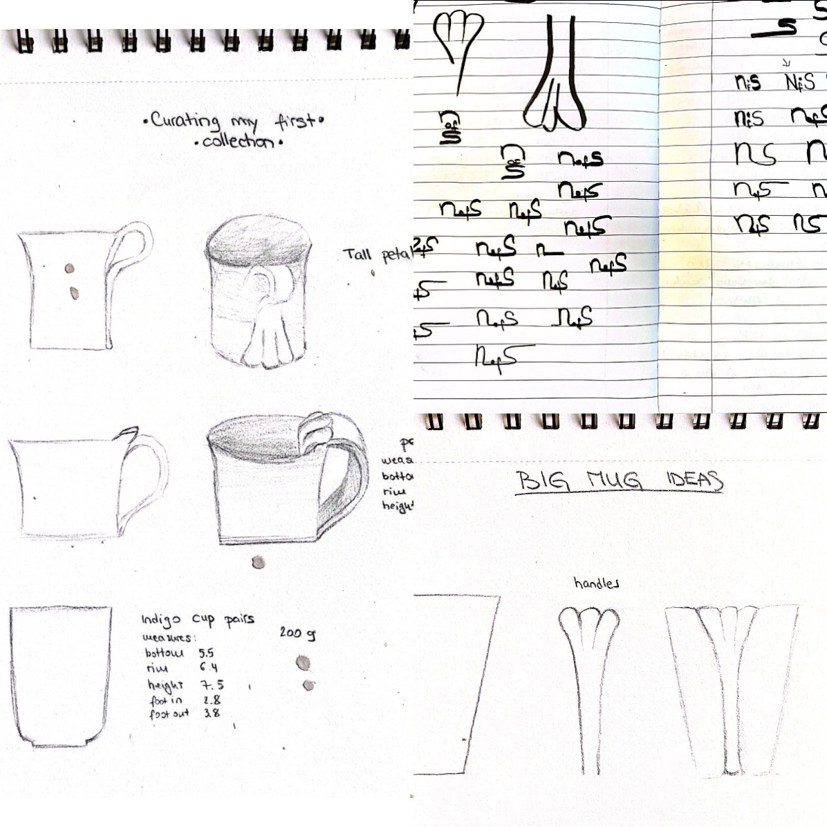
The initial idea of the Petrovka making finally took place and I am happy to unfold the whole process with each post. It was a period full of exploration, learning and acquiring techniques needed to put my ideas into solid form. Some situations were pleasantly surprising while others more of a lesson on “what to avoid” but I will get into all that as we go. If there is one key lesson, it would be to keep the glaze development separate from the clay related stages or work on the glazes at the very beginning of the collection. In the early stages I took time, did a lot of journaling and enjoyed spending time in museums. I cannot recall when exactly I started making the handled mugs with the petal-looking motif. It certainly did start with a little spark of an idea. Vague at first but rooted with strong intention and sense of direction. I was practicing repetition and consistency a lot and to keep myself engaged I started playing around with hand building, allowing my hands to do what they want.
On some days they resembled fragile petals, on others paws. A few of you would agree I shook more paws than hands in the last year. But no matter how my eyes perceived it on a given day I kept exploring, keeping any forced labeling ‘at bay’. Seeing what happens when I add elements or deduct them. Interplay of negative and positive. Shadow and light…
Slowly I got into the stage when I started recognizing what serves the cup and what does not. We lean into beauty and the seeming complexity of it and with that urge subconsciously start adding (or resort to the opposite with minimalist acts that we might not truly relate to). In “The Unknown Craftsman” Yanagi describes Japanese craftmanship present in everyday use and the beauty of pattern. A stitched pattern on a traditional piece of clothing as an act of mending a hole, an added pattern that serves the initial look of the garment. I am writing from memory, but something along these lines… What is the essence of the piece and what does it ask for?
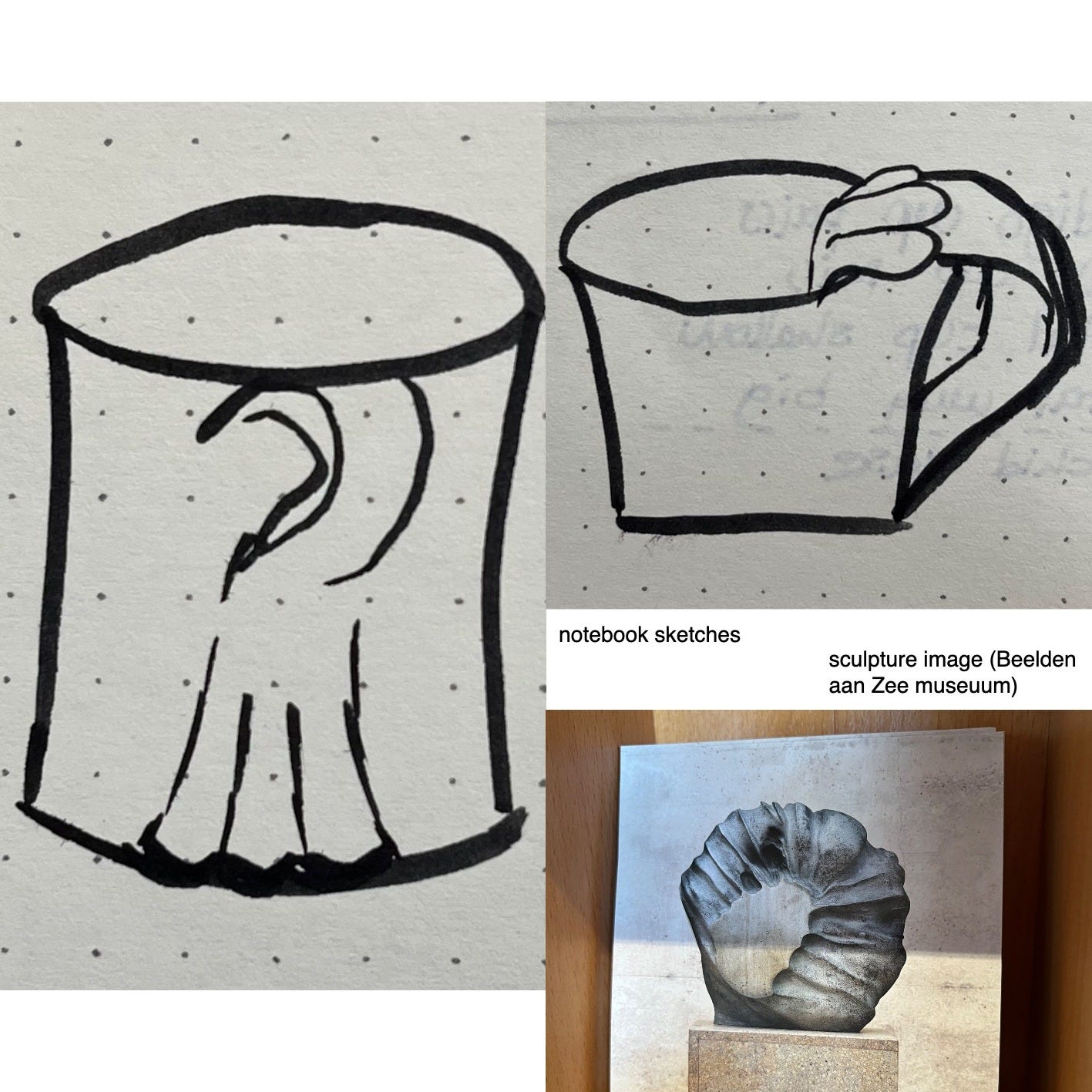
I leafed through my journal and found a lot of exciting entries, particularly in moments when I came up with an idea or a modification of a look I was not settled yet with. Interestingly enough, it was almost always during a shower which should not really come as a big surprise as these are the rare moments when one’s mind switches off. A moment when ‘dots’ come together in an effortless way, sharpening into a clear image.
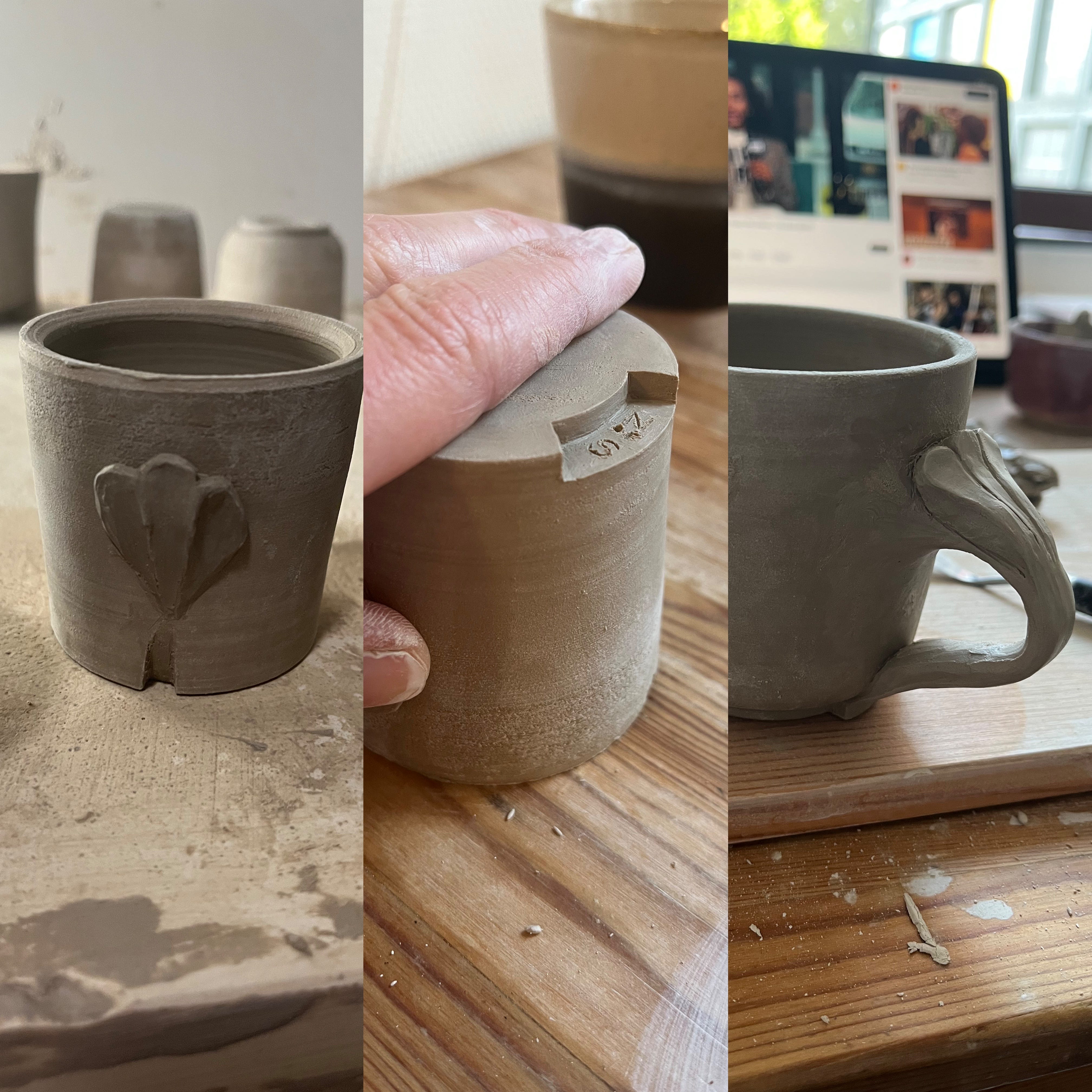
Around that time I also started working on my logo, aiming to find a design that complements my work. Something like a seam, a thread that is weaved into the whole garment, fulfilling its basic purpose while adding an aesthetic dimension to my work. Initally, the logo was carved into the foot of a cup, and while I already liked it as it was, there was room to expand this idea. I was always attracted to a deep red color used letter seals, illuminated initials (of medieval manuscripts) and vibrant satin book markers. A color with diverse symbolic associations and a lush appearance. Soon enough, a logo that started with a handcarving only was accompanied by a red glazed finish.
In Part II of the series I am going to reveal the steps on how Petrovka started resembling its final shape and the appearance of its echo piece, as well as elaborate on the logo development accompanied with notebook excerpts of drawings and the thinking process, technical challenges, solutions and inspiration snippets. I am thankful to all of you who took time to read this post. Until next time.
Yours truly,
Lidija